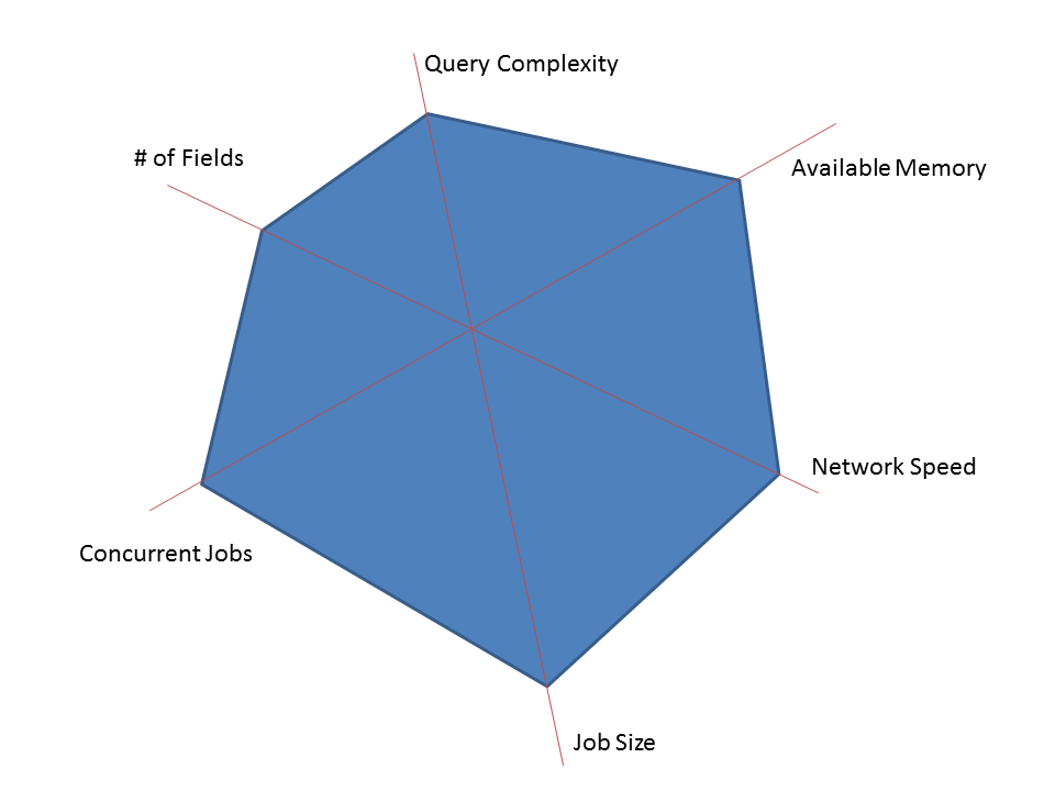
I think visually, so here's a way I like to communicate performance thresholds. There are a bunch of dimensions that might make an application behave differently. Test against those dimensions and plot the thresholds of each one. Here are some that I made up, for a theoretical application.
The goal is to have all real world scenarios fit inside your polygon. So here's a real world use of the application that we can handle no problemo.
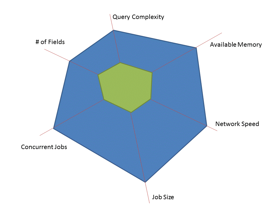
And here's one that pushing the limits a bit more.

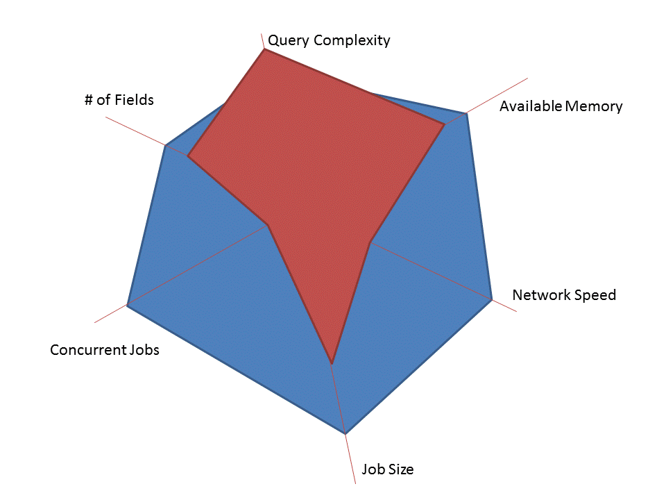
And here's one we didn't anticipate, or our app should never have allowed because it's clearly not going to work.
There are a few caveats to visualizing performance thresholds this way:
- We might have missed a dimension. Turns out that the phase of the moon dramatically affects performance and that wasn't a dimension we tested along. Oops. This is no fault of the visualization, but can most definitely happen (and in fact did just happen and prompted this post).
- Dimensions might not be independent. For instance, if you have more memory, the maximum allowable job size may go way up. That's hard to capture here, and often isn't necessary. If you're giving guidance to a customer on performance, skip the nuance and stick to what works.
- We might not really understand some of the boundaries as well as this diagram indicates. With performance testing, it's rare that you can categorically say that 1,000 visitors works fine but 1,001 visitors brings down your website. Build in some buffer when communicating.
- And remember, there is a difference between an app theoretically supporting a threshold and actually testing to that threshold. Theoretical boundaries need be called out clearly and separately.